PROJECT
_
Microsoft Overview
ROLE
_
Creative Direction
Concept Design
Art Direction
Design
Team Creation
Team Leadership
Project Management
Pipeline Creation
Custom Tools
SYNOPSIS
_
Concepting and creating animated content for Microsoft stores was substantial to say the least!
An ideal combination of art & science, this experience expanded my perspective on creative work in significant and lasting ways. Working in such large formats, evolving the Surface brand, and assembling and leading a team of creatives, technologists, and producers, working on this years-long retainer strengthened my roots in creative problem solving, branding, and campaign ideation. It was a huge endeavour, and its success was found through the efforts of many.
The experience reinforced the power and need of a strong team effort while working within a single global brand for over five years. It demanded expertise in design, strategy, branding, and how an audience experiences work without getting seasick, because with huge displays that move too fast, people can get sick. Wild.
OVERVIEW
_
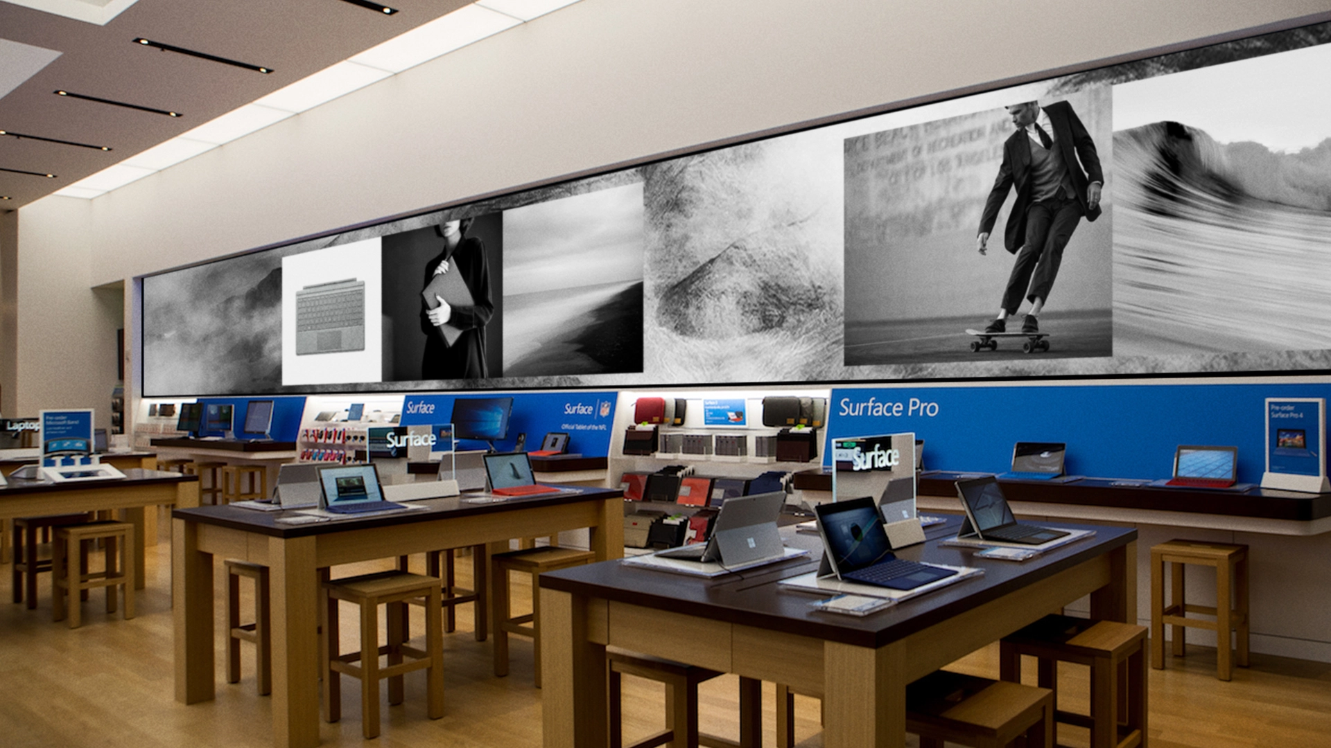
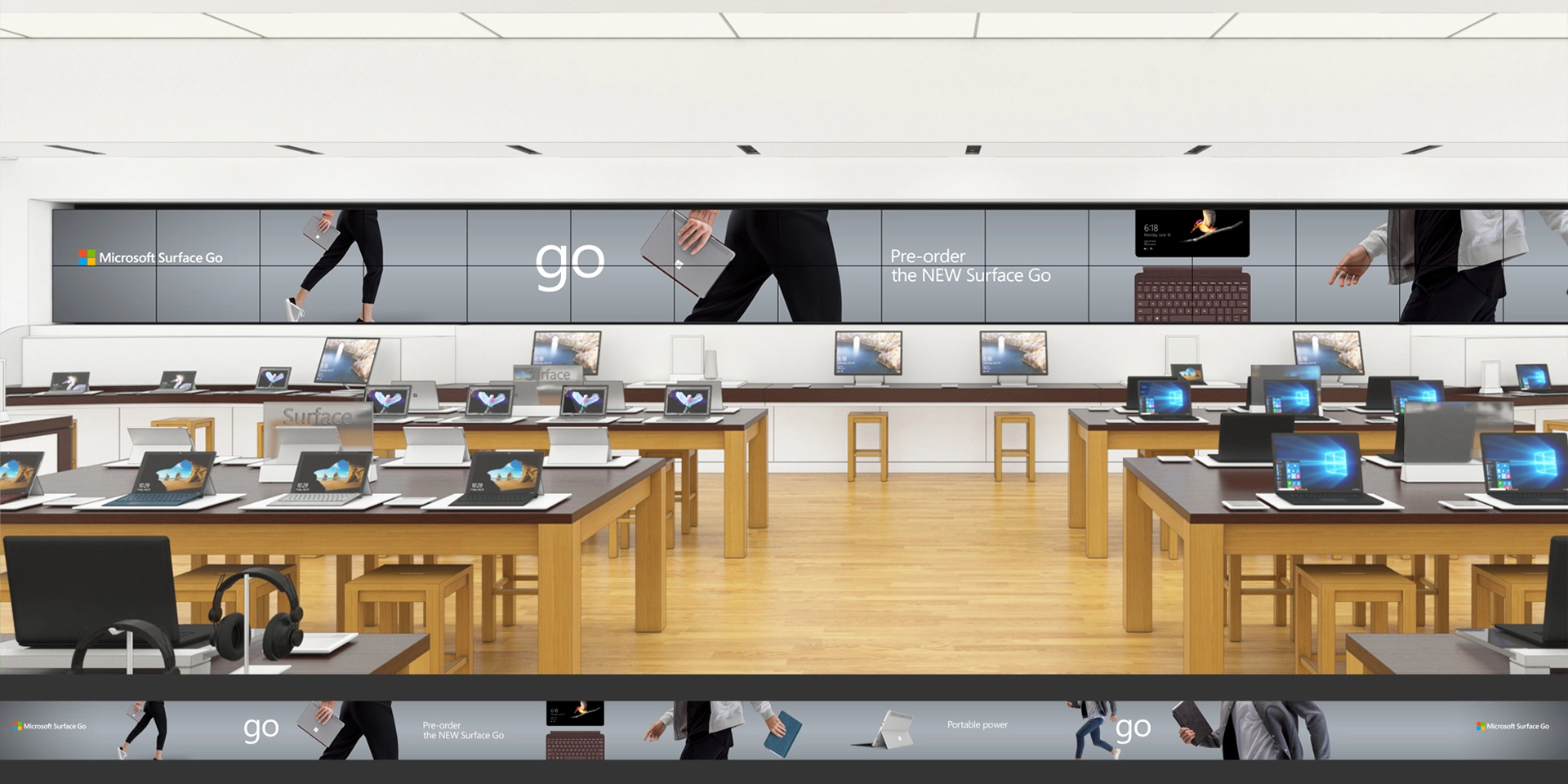
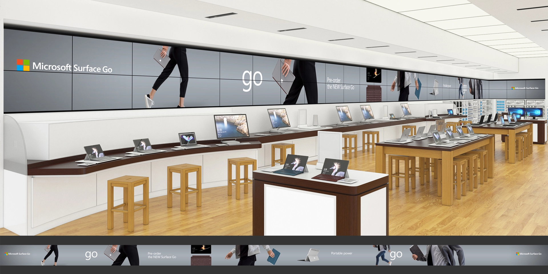
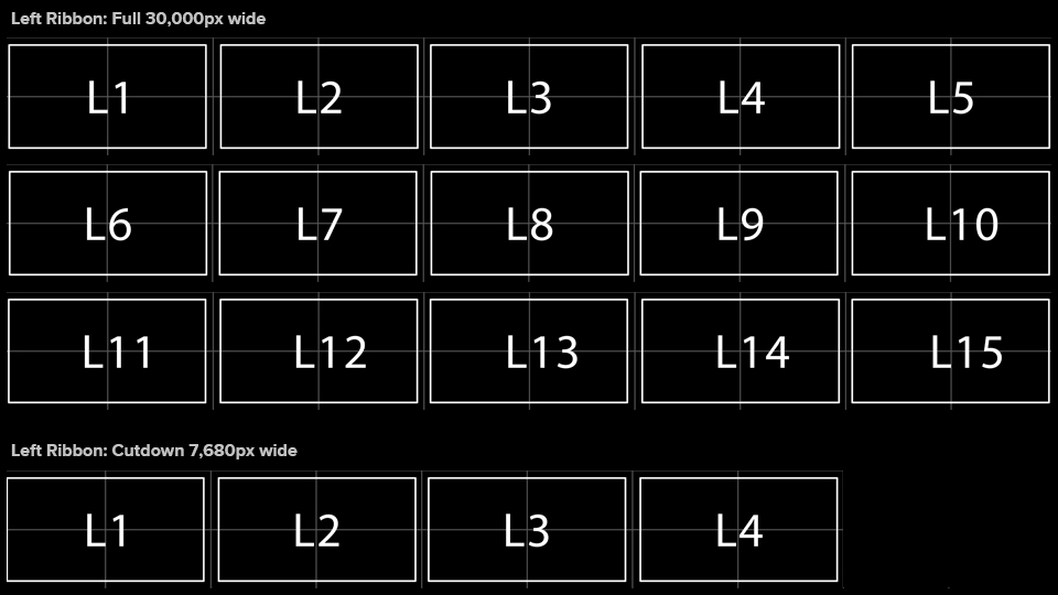
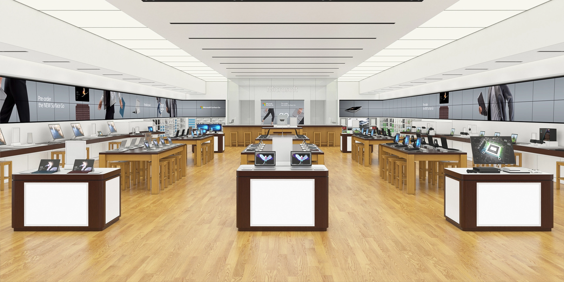
Each main piece of content, called a 'Video Ribbon,' was designed as a 30,000 px wide layout (15 HD screens wide), with separate left and right layouts.
The main ribbons had to be created in a way to fit the global reach of Microsoft retail stores, which required each layout to be scalable. Store sizes from around the world resulted in layouts ranging from 30,000 pixels down to 7,680 px wide (4 HD screens wide) or less, with each cut down retaining required messaging and branding. The complex creative puzzle required top-line awareness while in the ideation and design phases to identify problems before they occurred.
In addition to video ribbons, there were also a wide range of theater screens, with ratios ranging from 1x1 to 16x9, with some 9x16 in to keep things lively. To create efficiencies, the team spent time creating automated versioning tools from scratch within After Effects, which let math create the first pass. This was incredibly time-saving as it reduced production time by a quarter.
We recreated stores in 3D, as well as flying to a West Coast location for practical large-scale testing for each piece of creative. Producing content at such a large scale required multisensory and field-of-view awareness and the potential issues that can occur when things were pushed too hard. Weeks were spent testing velocity to ensure applied motion theory didn't overwhelm the audience.
PROJECT TITLE
_
Surface Alcantara
ROLE
_
Creative Direction
Creative Strategy
Group Lead
Designer
SYNOPSIS
_
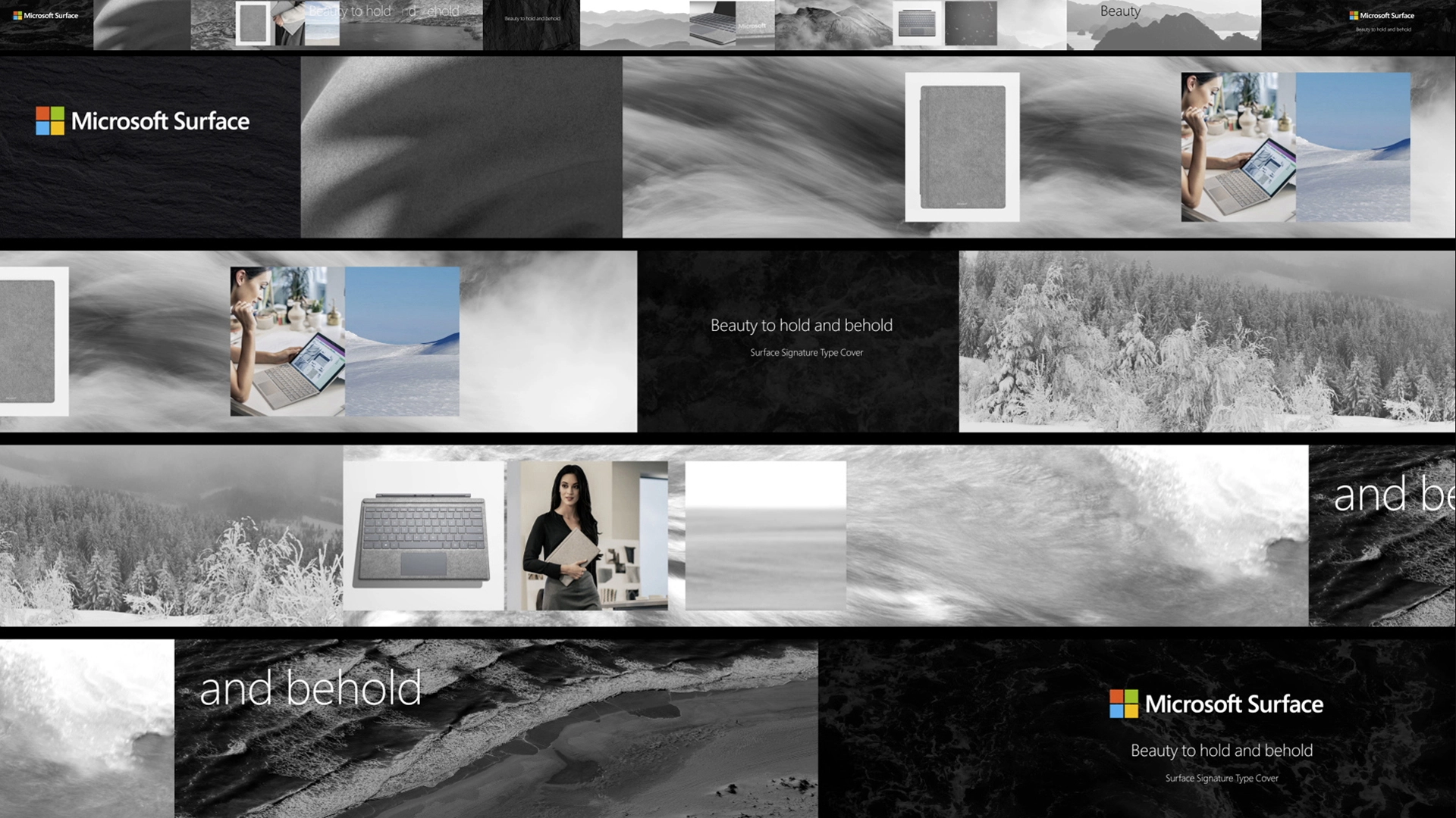
An example of a Surface project, Alcantara, was an important pivot toward luxury offerings from the Surface brand. We had the opportunity to present creative strategy that evolved the brand to allow space for luxury offerings which laid a foundation for future product launches. It was an initial lesson in "Brand as Experience" that heavily influenced creative thought and approach.
BREAKDOWN
_
Custom Tools
ROLE
_
Team Leadership
Efficiency ideation
Cheerleader for Smart People
QA
SYNOPSIS
_
The team had many brilliant minds over the years who were able to create several custom tools to maximize efficiencies. It was a dream to be able to think of an idea and have people much smarter than I say, 'Sounds good—we can make that.'
With hundreds of deliverables for each project and often having several projects active at once, the flood of assets would overwhelm any team without identifying areas for efficiency and automation. After Effects revealed its true potential several times over as we created tools capable of automatically resizing content as well as versioning hundreds of items.
These custom tools saved weeks per project, totaling months saved per year of production time.
Below is a sped-up tutorial video we made to help other vendors utilize our tools. Ever wonder what 20 minutes of instructional content looks like in 15 seconds? Check it out!
TM™
Jason Salo
Husband. Father. Friend. Creative.